
#Branding
Building upon the foundations of bold strategic branding seen in the Web3 space, Strategy EGLD is a concept that envisions the largest reserve of EGLD—rooted in consistency, innovation, and alignment with the MultiversX ecosystem while introducing a distinct visual identity.
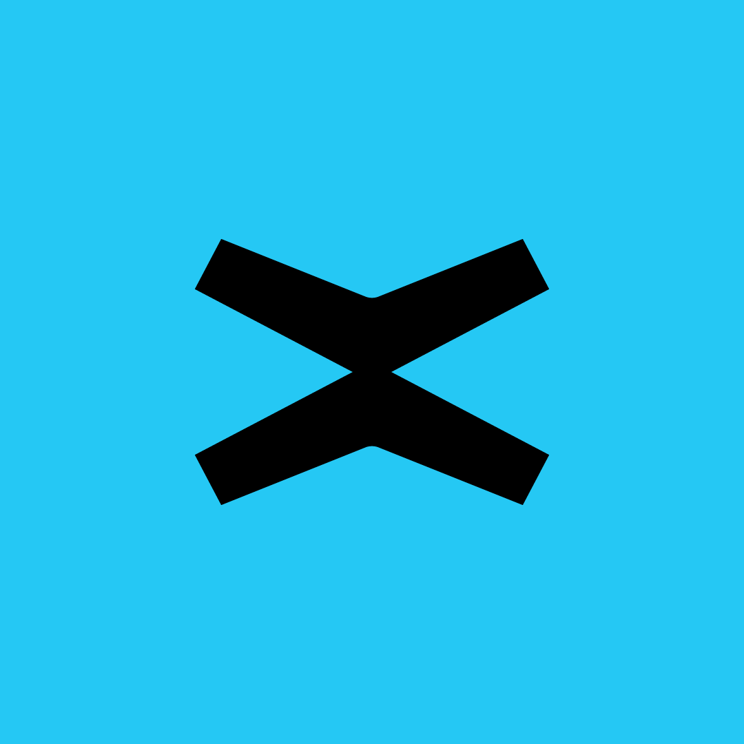
Unlike its Bitcoin counterpart, which embraces a deep, fiery orange, Strategy EGLD takes a different approach—leveraging a bold cyan-teal (#25C8F4) to stand out while maintaining harmony with MultiversX’s aesthetic. This project is a creative exploration, not officially given away (yet) to the person leading the initiative, but rather a demonstration of how I see the brand evolving within the broader ecosystem.
Objectives
Primary Goal: Establish a compelling conceptual identity for Strategy EGLD, maintaining consistency with Web3’s strategic branding approaches while differentiating through color and tone.
Secondary Objectives:
- Ensure alignment with MultiversX’s design ethos, particularly through typography (Roobert PRO Medium, customized for a more compact feel).
- Explore a unique brand voice and visual language that signals power, innovation, and trust.
- Develop a strong, recognizable visual identity for a future potential execution.
Approach
Brand Strategy: The foundation of this concept is cohesion with MultiversX’s brand language while carving out a unique positioning through color and iconography.
Typography & Identity: The use of Roobert PRO Medium—the same as MultiversX but adjusted for compactness—creates an instant sense of familiarity, ensuring a seamless brand extension.
Color & Symbolism: The shift from MultiversX’s default color scheme to #25C8F4 represents boldness, clarity, and futuristic vision, while the elevated ‘X’ icon reinforces the idea of exponential potential and strategic growth.
Execution
Visual Identity:
- Custom typography modifications to ensure a sleek, high-impact look.
- Elevated ‘X’ icon design to symbolize power, growth, and expansion.
- High-contrast digital aesthetics, ensuring a strong Web3 presence.
Conceptual Brand Positioning:
- Built on principles of trust, security, and long-term vision, mirroring the ethos of strategic reserves in Web3.
- Intended as a proof of concept, setting the stage for a potential execution in the future.
Outcomes
- Results: Successfully launched a brand identity and website that not only enhances Starblock’s online presence but also clearly communicates their service offerings and creative approach.
- Impact: The new site has streamlined communication with clients, improved user engagement, and positioned Starblock as a modern, innovative creative agency in a competitive market.
Challenges & Learnings
Challenges Faced:
- Finding the balance between consistency with MultiversX and the need for a distinct identity.
- Ensuring that the color shift enhances, rather than dilutes, brand recognition.
Key Learnings:
- Brand consistency matters in Web3, but subtle differentiations (like color and typography tweaks) can create a powerful impact.
- The interplay between familiarity and uniqueness is crucial in positioning a new strategic entity within an existing ecosystem.
Visuals & Media


Final Thoughts
Strategy EGLD is a vision, not yet a reality—but it represents a way forward for the branding of strategic reserves in Web3. By staying aligned with proven design systems while making subtle yet effective distinctions, this concept lays the groundwork for a cohesive, forward-thinking identity within the MultiversX ecosystem.
Links & References

Back to